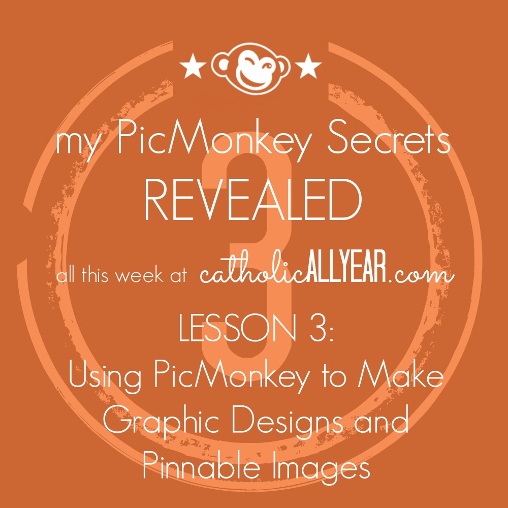
We’re out of town, so I thought I’d take this week to share with you some of the tips and tricks I use on PicMonkey to make this blog prettier. This is installment three of four, also see Lesson 1: Using PicMoney to Make Good Photos Great and Bad Photos Pretty Good, and Lesson 2: Don’t Make These Mistakes Using PicMonkey to Make Shareable Quotes on Images. PicMonkey is an online photo editing and design site. The basic version is free, but you can also choose a yearly subscription to “Royale” that gets you more options, and no ads. This is not a sponsored post, I just like PicMonkey. This post contains affiliate links.
PicMonkey is great for photos (um, obviously), but I also use it quite a bit to create easy graphic design images.
These can be used for cards and posters, party decorations, or to give a blog post an image when you don’t have any photos to go along with it.
The trouble with trying to create graphic images is that the possibilities are pretty much infinite.
I have exactly zero training or professional experience doing this. My main technique is to play around with stuff and move it around and switch it out until I like the way it looks. I’ve refined my “style” a lot over time. I think you have to be willing to make some mediocre images at first, while you figure out what you actually like.
I’m going to share some examples of things I’ve made, and explain a bit about how I make each type of image.
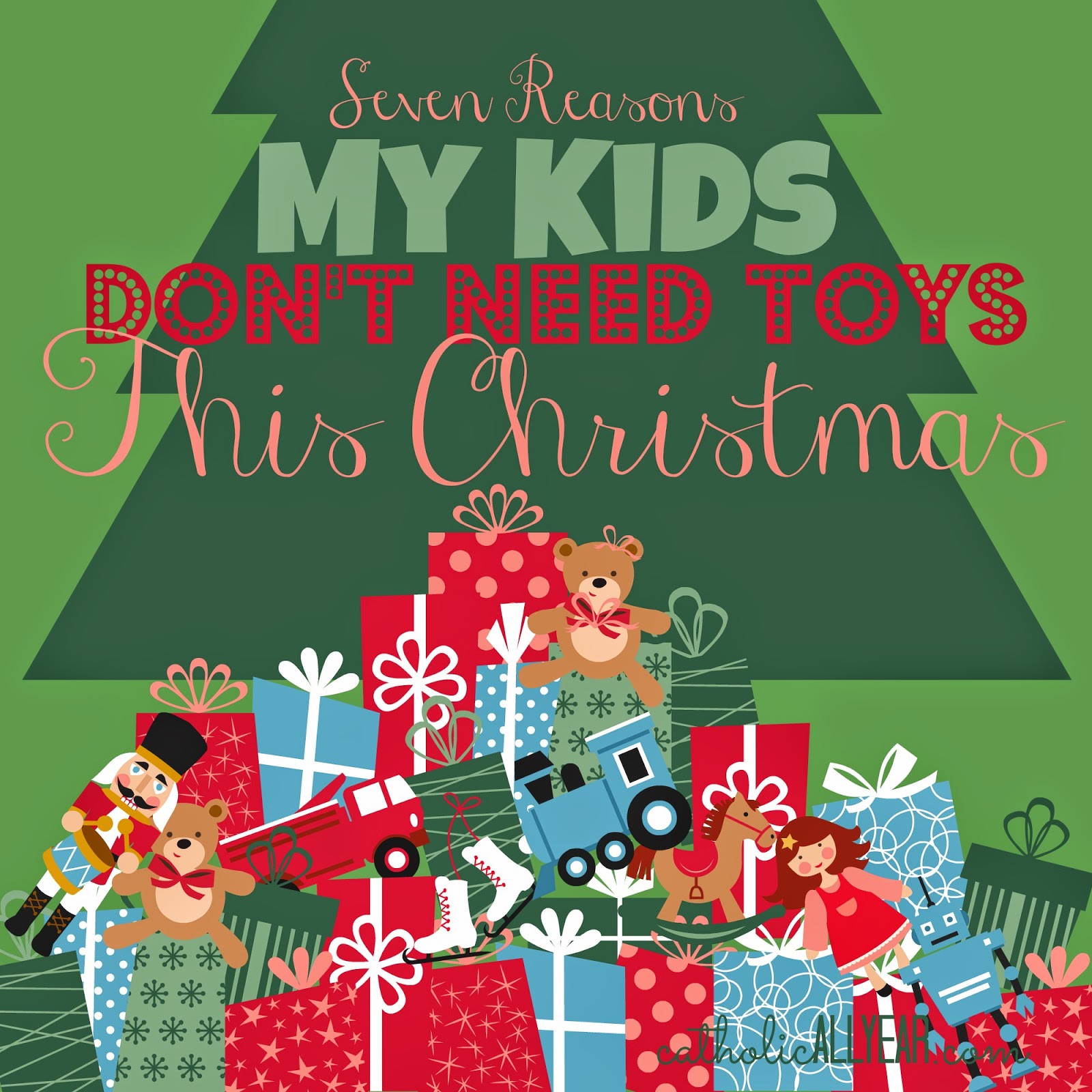
I don’t always have photos to go along with posts I write. But I’m a very visual person, and I just can’t bring myself to hit publish on just a bunch of words. Plus, if you want a post to be pinnable and sharable on Facebook, or show up in related post widgets, it really helps to have an image. So, if I don’t have any photos, I make a graphic image of the title of the post in PicMonkey.
 |
| Themes Menu, School U Theme (here’s this post) |
 |
| Themes Menu, Santa Land (here’s this post) |
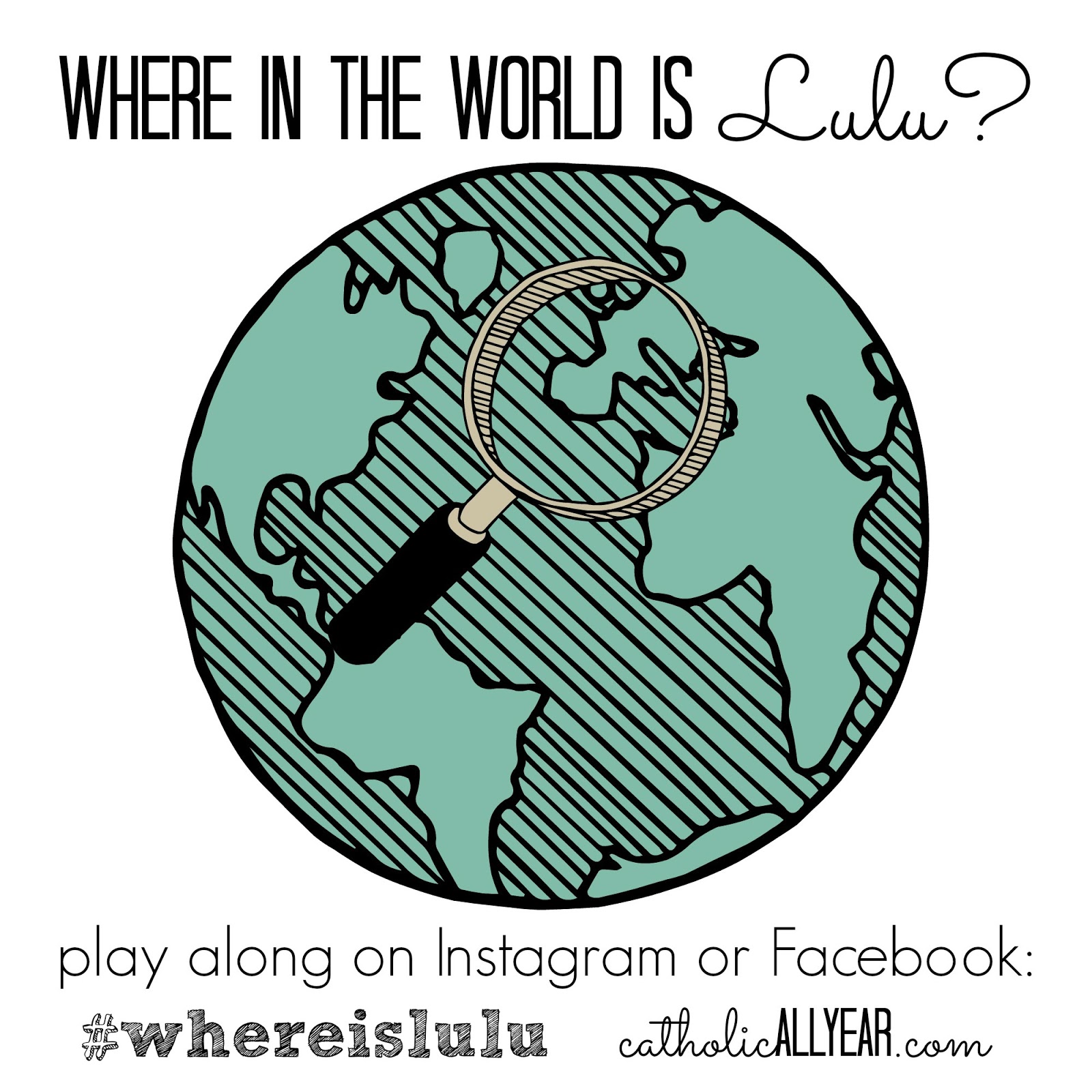
I created this image for a little social media game I did last year:
 |
| Themes Menu, School U |
This is an image Jack (12) made to print on an iron-on transfer and put on a t-shirt for one of his brothers for Christmas:
One note: see how it looks kind of dingy? While the image above, also made on a white background looks . . . white? I don’t know why that happens, and I’ve only noticed it as an issue putting the images on the blog. For some reason, if you save the image, then open it in PicMonkey again, then save it again, that seems to fix it. I don’t know why. But it works.
 |
| Themes Menu, Comic Heroes |
 |
| Overlays Menu, Critters (here’s this post) |
This one is probably my favorite of the bunch. PicMonkey has a lot of choices, but they did NOT have any castles or invading armies. So I made them myself . . . out of shapes:
 |
| Overlays Menu, Geometric & Banners / Themes Menu, Cupidity (for the arrows) |
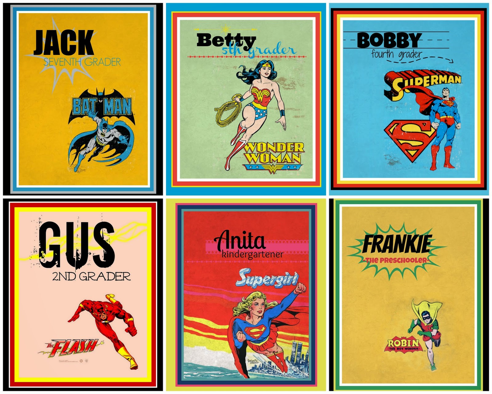
I made these notebook covers for the kids at the beginning of the school year.
I found the vintage superhero images online, saved them to my computer, then opened them in PicMonkey. I put Simple Borders around the images, matching the color of the original background using the Eyedropper Tool, then cropped the images to put the superhero where I wanted it on the page. Wonder Woman and Superman had an antiqued background that I matched in the Texture Menu, using one of the Smudge options, faded way down. For Supergirl, I went to the Effects Menu, and used Draw to fill in the background across the page. Then I added text, overlays, and a few thin colored borders.
To make my most-shared image EVER, I found this pleased looking beef cow online and saved him to my computer. I opened up a blank square canvas under Design, then went to the Overlays Menu, and selected Computer from the Your Own dropdown menu. I selected the cow, and made him the size I wanted, then added my text. If the edges of my overlay had been visible, I would have used Draw, and with a soft brush, blurred the edges. (You have to combine the image elements on the menu above the image you’re creating to be able to draw on an overlay.) Then I added text. Since I planned to use the image on Facebook, rather than as a printable, I saved it at 1000×1000 pix, which is still plenty big.

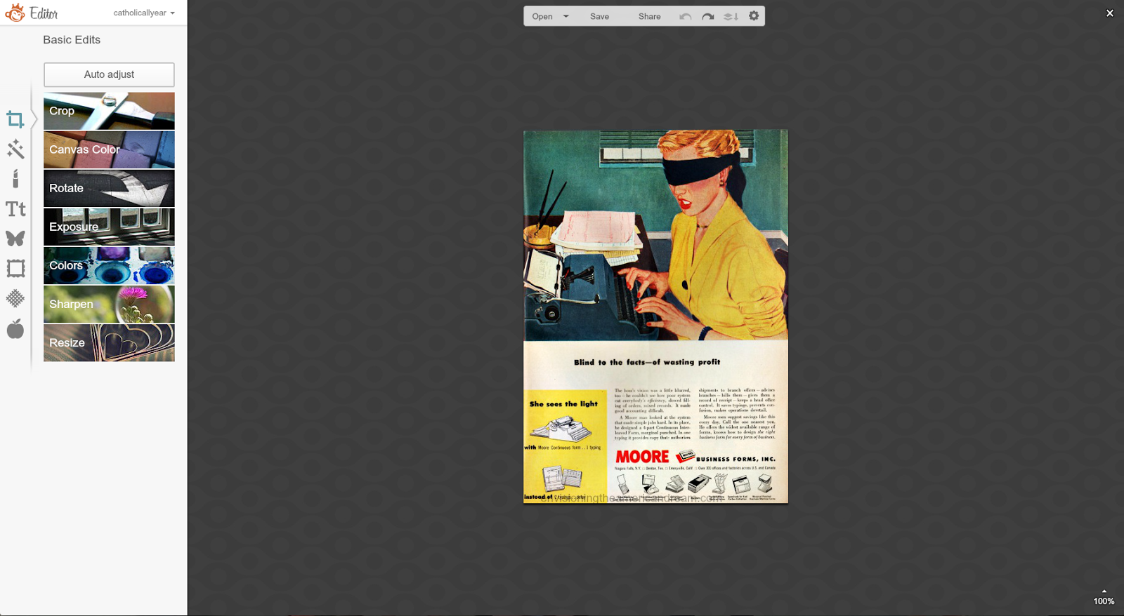
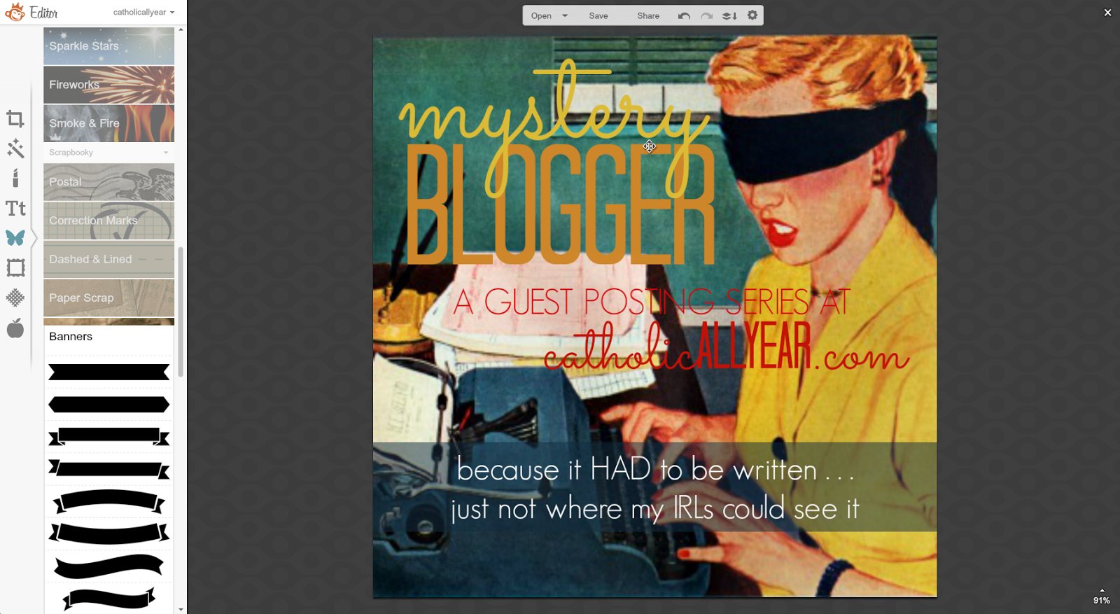
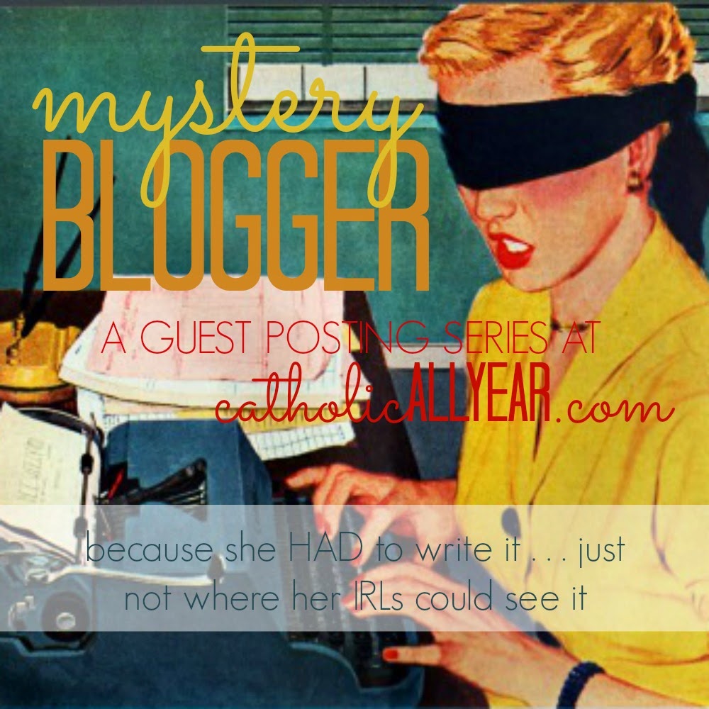
And now, I’m going to take you — step by step — through how I created a graphic image for a guest posting series I’ll be hosting on the blog during my “maternity leave” in August.
1. I looked through a TON of vintage images, until I found one I liked, that I thought would work with the title of the series. I saved it to my computer, then opened it in PicMonkey.
2. From the Basic Edits Menu, I cropped the image to square.
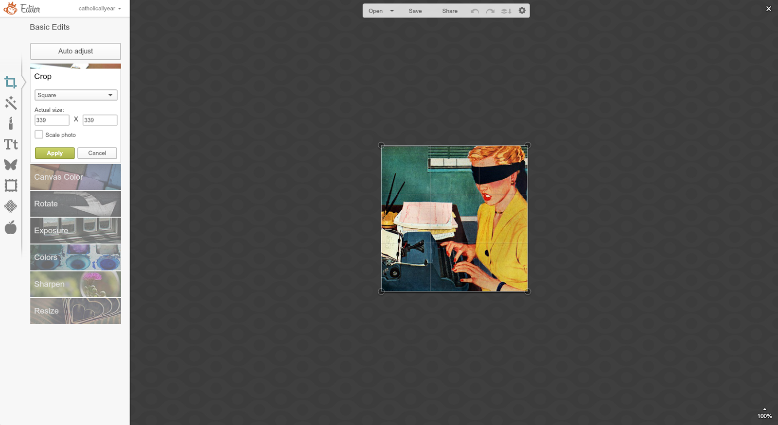
3. Also on Basic Edits, I resized the image to 1000×1000.

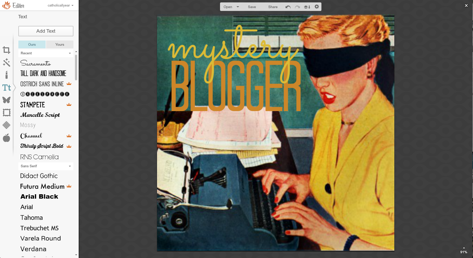
4. I started adding text, matching the colors to coloring in the image using the Eyedropper Tool. By right clicking on “mystery” I could select to bring that word to the front of the stack of text, so the y’s were visible.
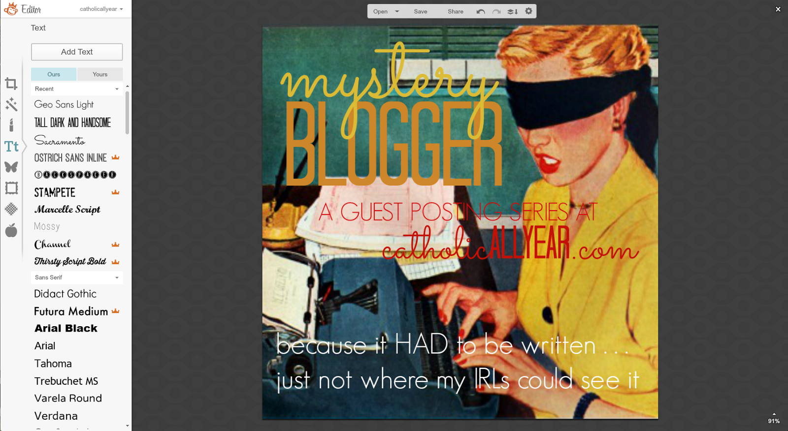
5. I added the rest of the text I wanted on the image, but was having trouble with the visibility on the bottom part.
6. To make it more visible, I selected a banner from the Overlays Menu, stretched it across the bottom of the image so that the indented edges weren’t visible, and faded it so the the original image shows through.
7. But I wasn’t quite feeling it. So I decided to try putting an overlay over the whole image, to make the text stand out. I selected a square from Overlays, Geometric.

8. I made it white and faded it way down on the little pop-up menu.
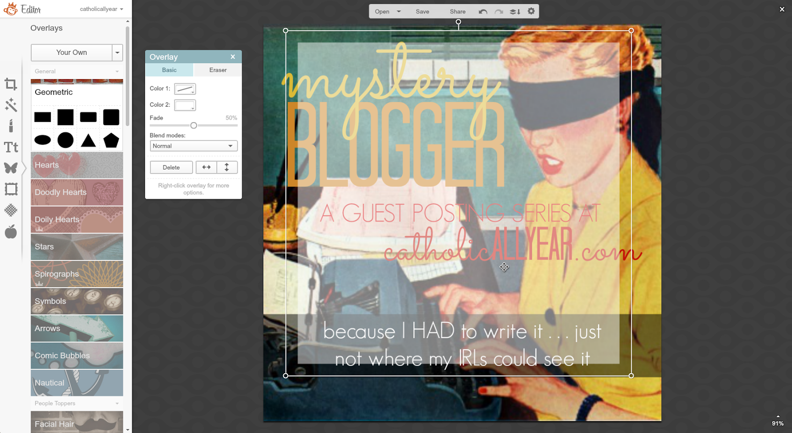
9. And I stretched it to cover the whole image, then right clicked and sent it to the back, behind all the text, and the banner.
10. But then the tag line was TOO visible.

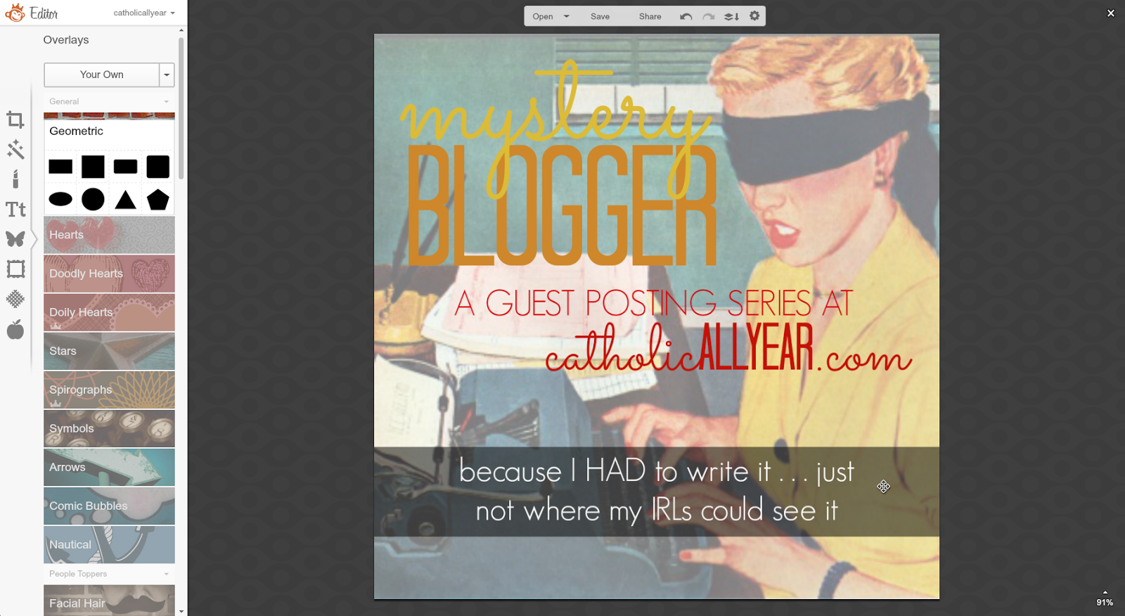
11. So I got rid of the banner. But I still didn’t like it as much with the muted background. So I resized the square overlay into a white banner behind the (now teal-colored) tagline text. And I was happy with that.
And that’s that. Now you have to wait all the way until August to read the posts. But I hope you’ll be able to keep yourself occupied with your awesome PicMonkey skills until then.
Don’t be afraid to make lame stuff. Making lame stuff is the first step toward making awesome stuff.
If there are any of you left who haven’t died of boredom or sprained a finger with all the scrolling, there’s one installment of this series still to come . . . Using PicMonkey to make word art.